Ivor Goodsite Hoarding Competition 2018 winners

Ivor Goodsite Hoarding Competition 2018 winners Considerate Construction Scheme

The design, artwork and printed hoarding competition encourages anyone registered with the Scheme to invite local communities to help design and decorate their hoarding based on a chosen theme. 

The high standard of artwork this year has been truly exceptional, all entries showed an incredibly high level of creativity and innovation.

A multitude of themes which include ‘Autism Awareness and Bringing the Community Together’, ‘Careers in Construction’, ‘Unity and Equality’ and ‘Space - A never-ending dream’. 

Winners of this year’s competition are: 

Bowmer & Kirkland

With the help of: Eden Park High School, Beckenham, Kent.

CJ Construction (Wales) Ltd

With the help of: Pupils and staff of Ysgol Bae Baglan School, Port Talbot, West Glamorgan.

Galliford Try Building

With the help of: LinkAble – a charity supporting young people and adults with learning disabilities. 

Galliford Try Partnerships

West with the help of: Frampton Cotterell C of E Primary School, Bristol.

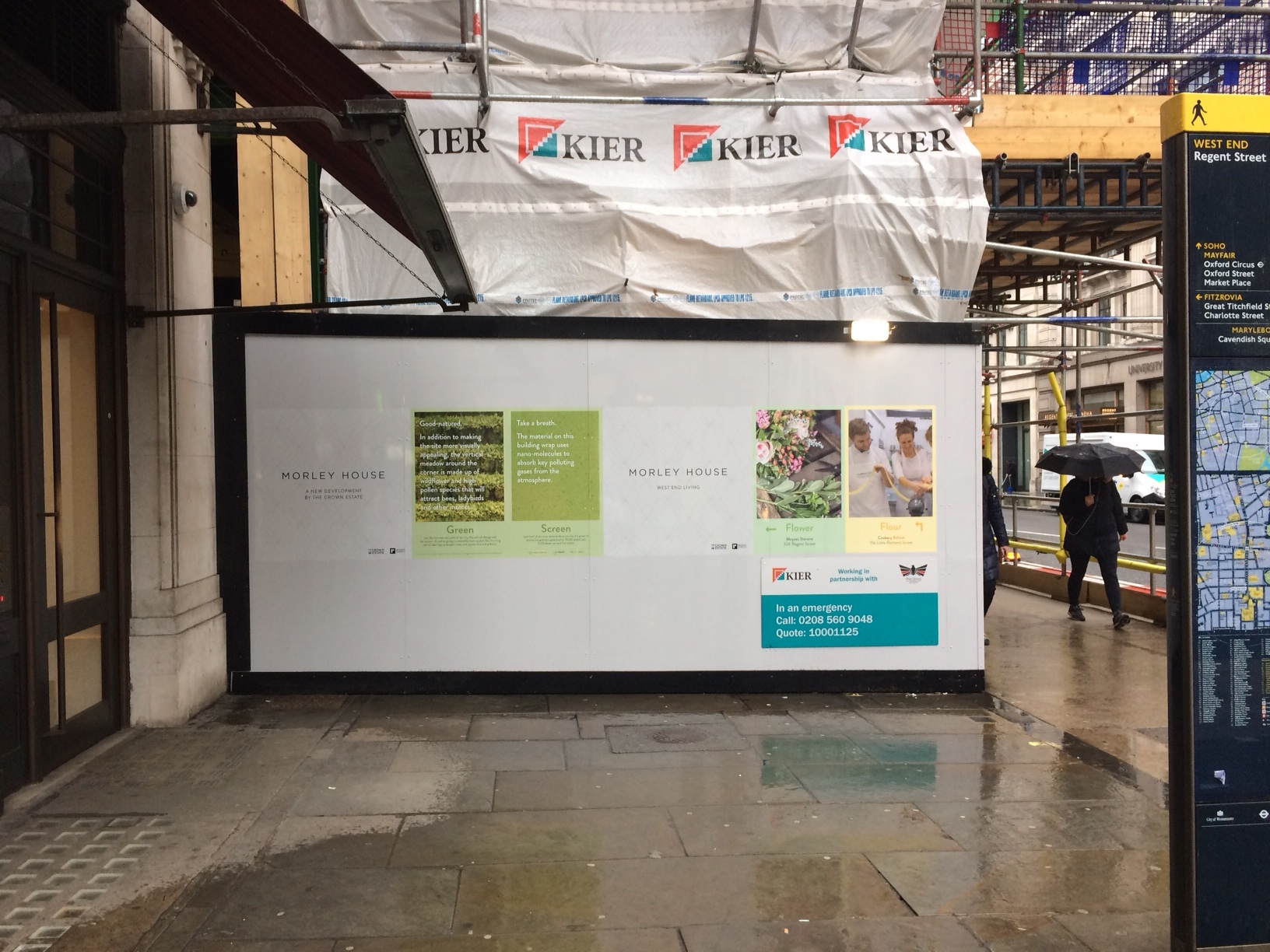
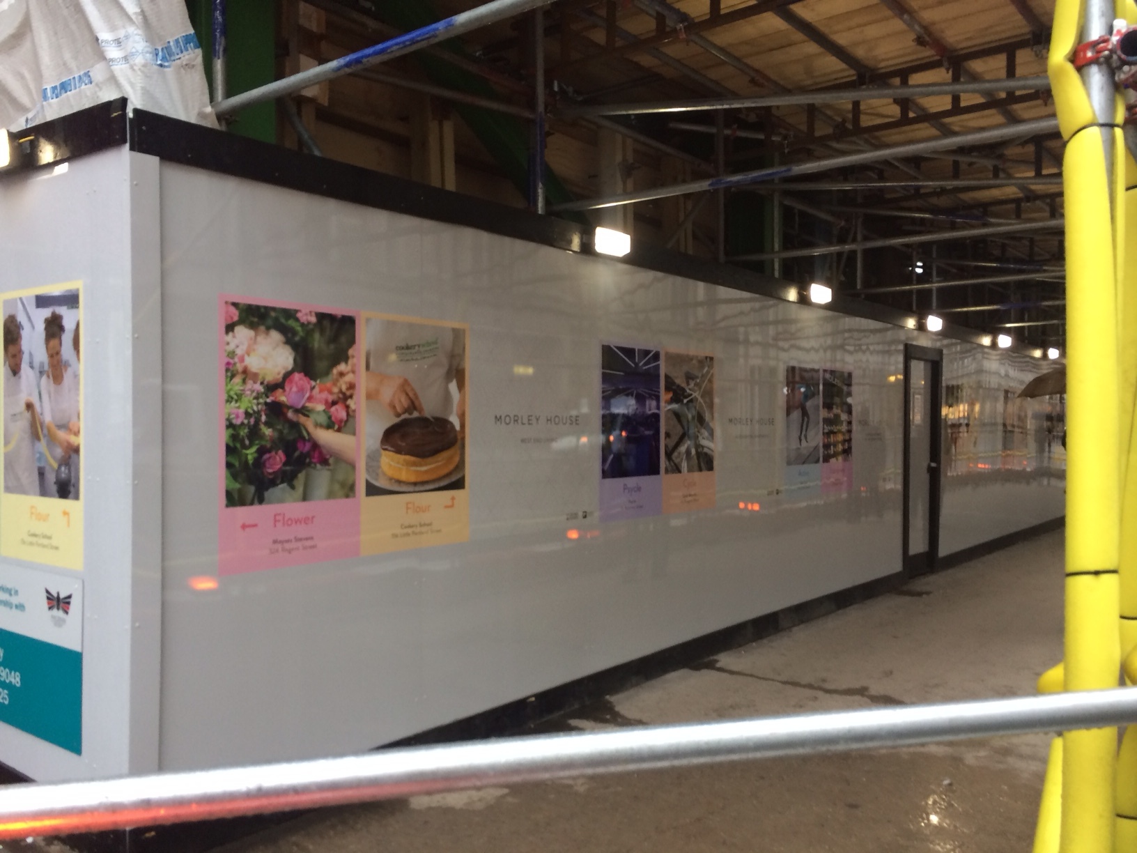
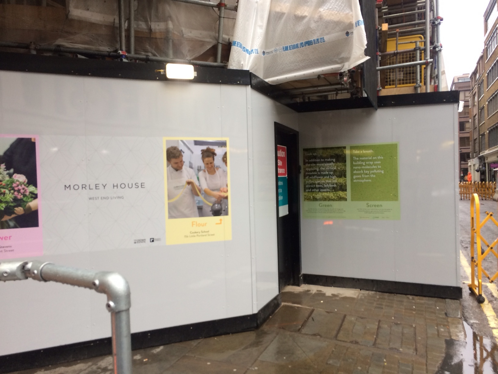
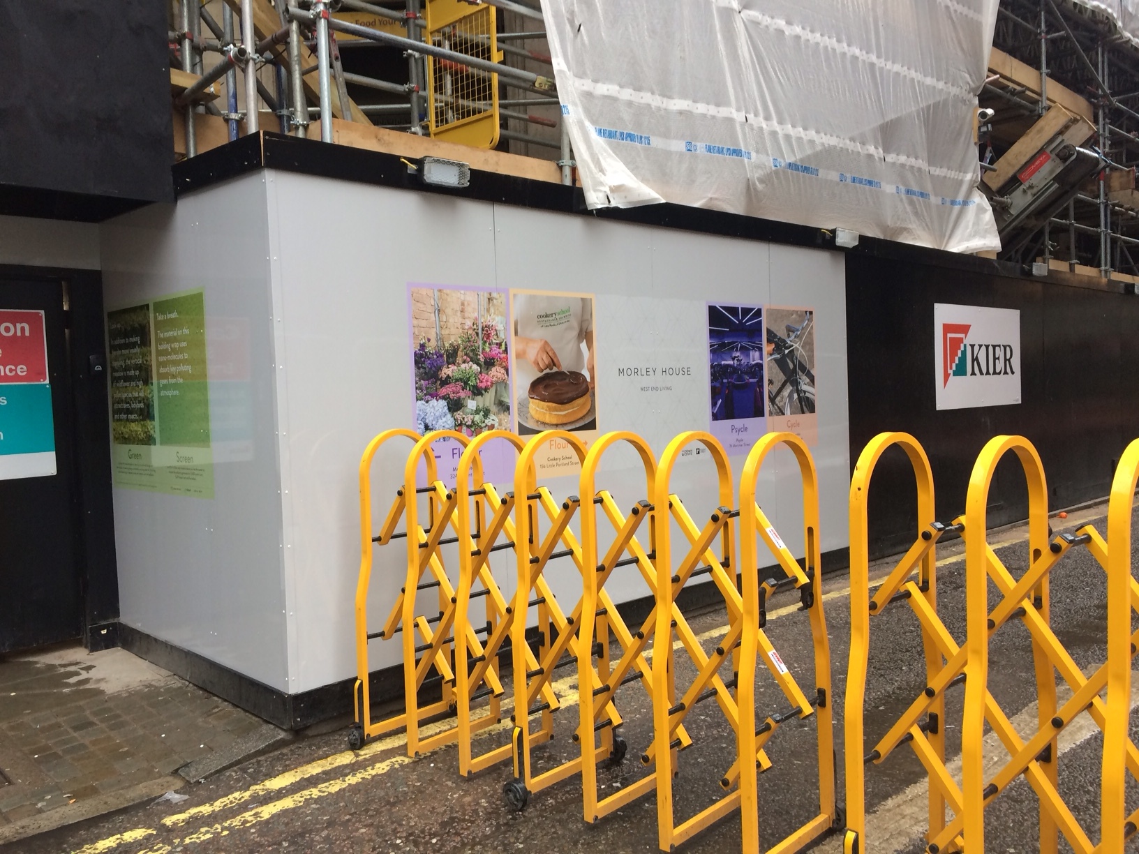
Kier Construction

With the help of: Wendover C of E Junior School, Wendover, Aylesbury, Buckinghamshire.

Lovell Partnerships Ltd

With the help of: Branston C of E Primary School, Lincolnshire.

McLaughlin & Harvey Construction Ltd

With the help of: Hill of Banchory Primary School, Aberdeenshire.

One Way Vision Window Graphics installation at King's Cross

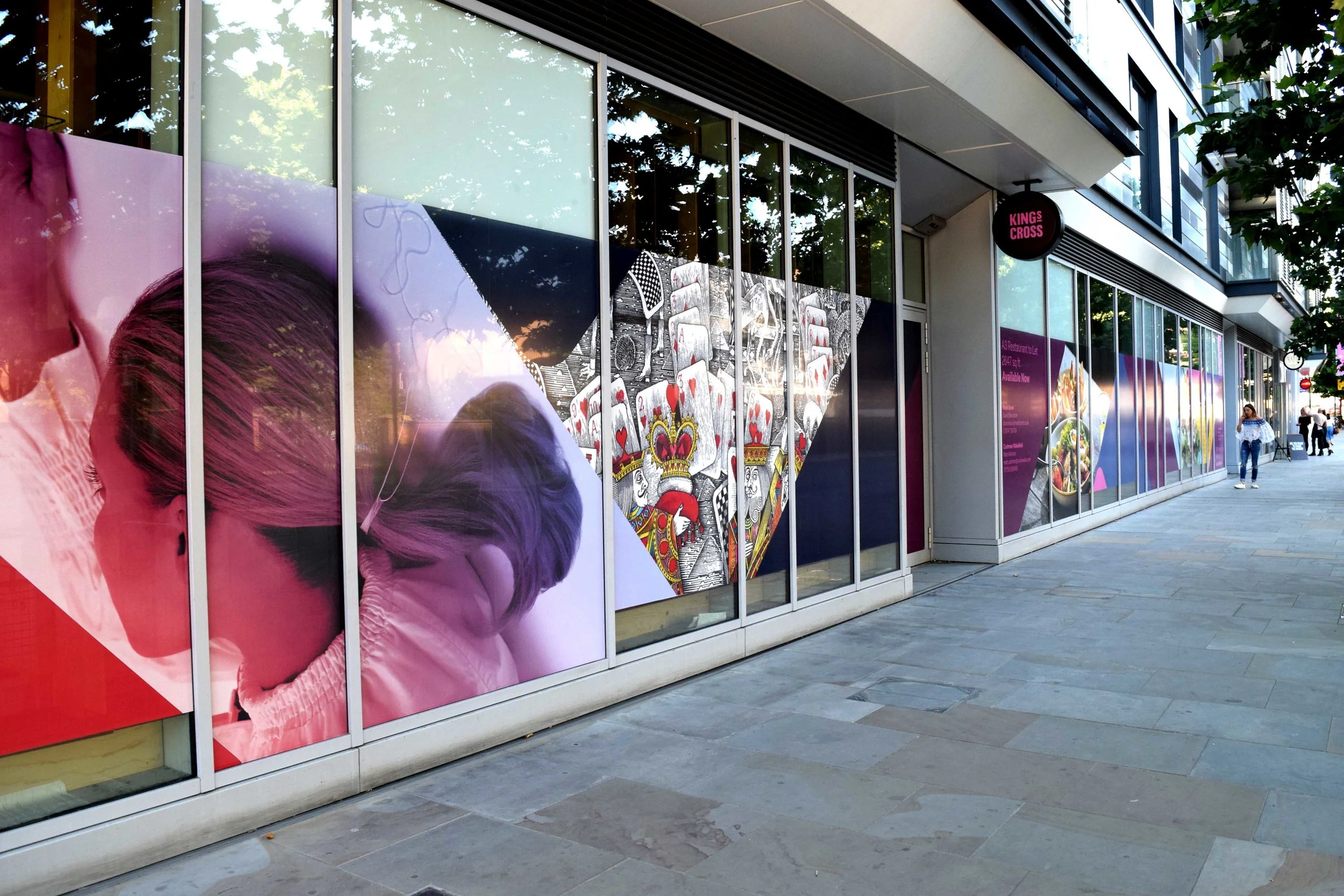
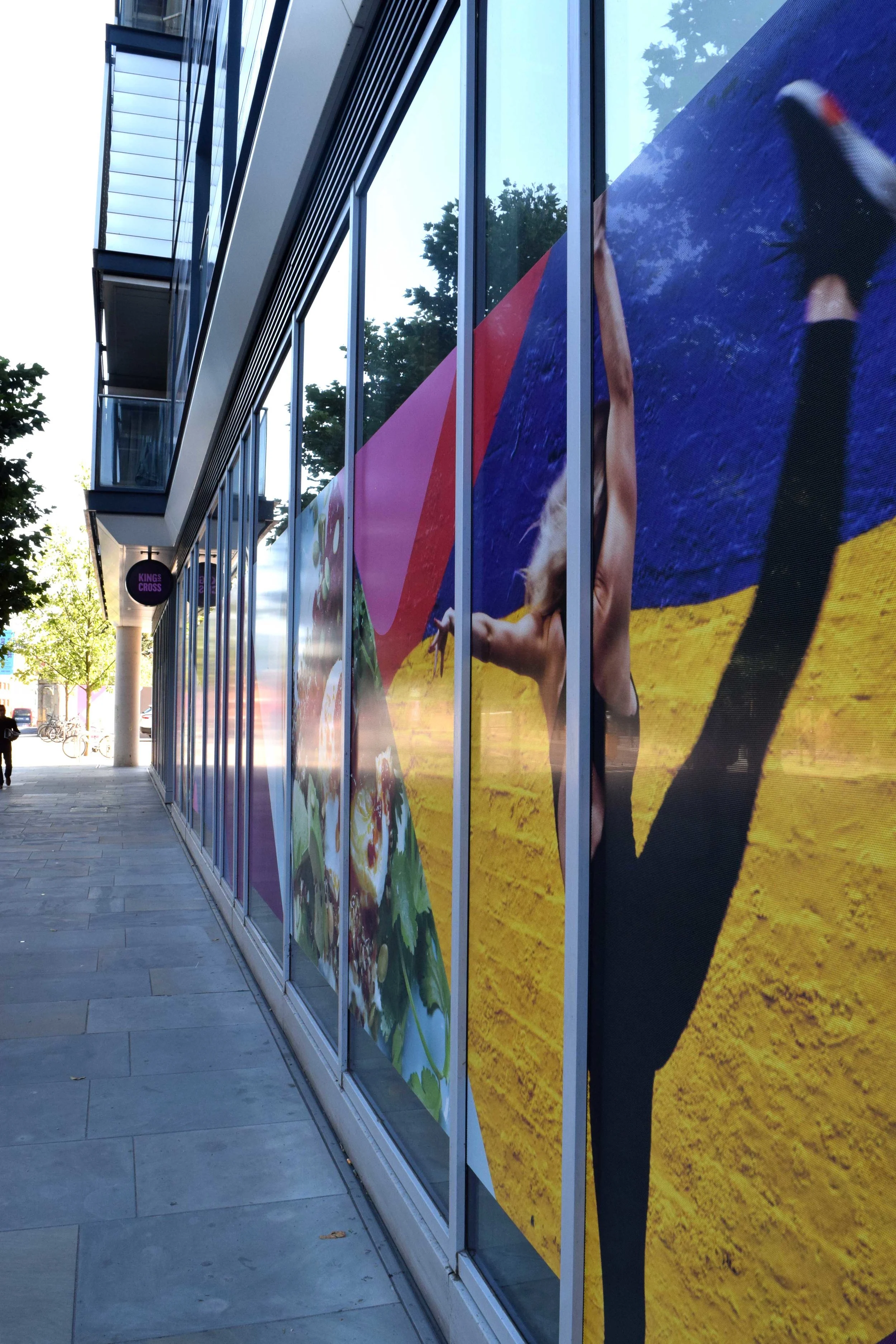
In addition to a number of printed hoardings we have installed around the King’s Cross development sites, we have also recently produced window graphics to advertise new commercial restaurant space. We used one way vision graphics, meaning those from the outside cannot see inside which provides those working with privacy. From the inside, the windows however remain see-through and people still get the delights of looking outdoors, and not blocking out the daylight/ street atmosphere. Magic!
Contravision

Contravision

Window Graphics

Netherlands opens first 3D printed bridge

The Eindhoven University of technology, and BAM, have joined forces to create a first of its kind 3D printed concrete bridge.
The bridge connects two banks over a river, the primary use being for cyclists but according to the designers could hold the weight of up to 40 trucks.
Printing the bridge made for less waste and used fewer resources, while giving the designers more flexibility with shaping the bridge. 

Video and more information here:
https://www.designboom.com/technology/tu-eindhoven-3d-printed-concrete-bicycle-bridge-gemert-09-08-2017/ 

3D printed cycle bridge in the Netherlands. Photo: BAM Infra
Picture Source

Site Hoarding Project - London EC4

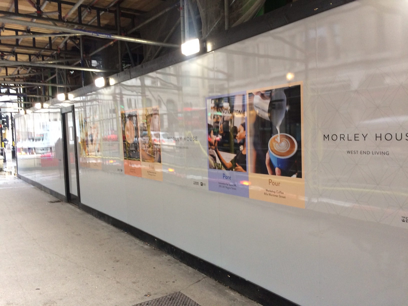
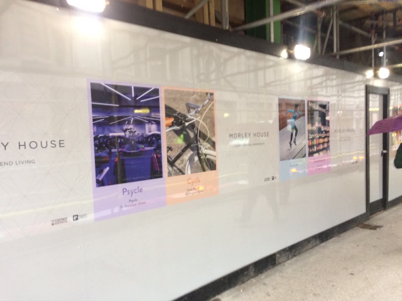
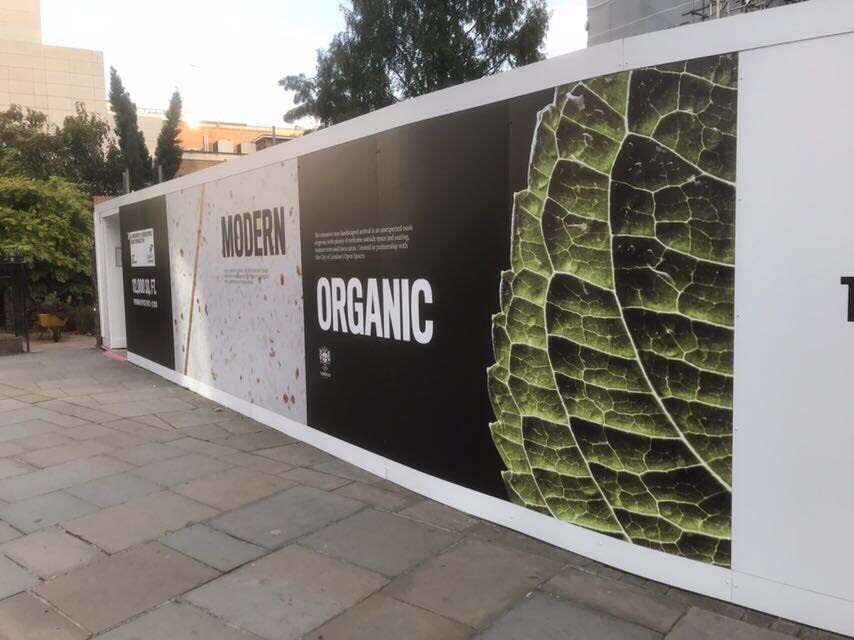
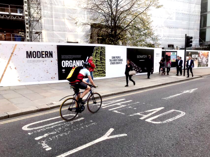
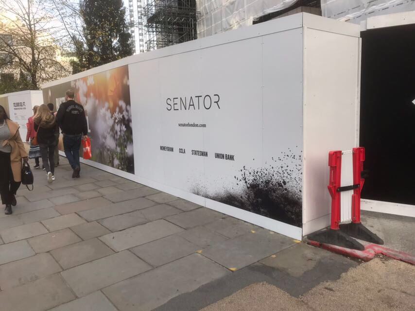
Our latest printed hoarding and installation project can be found at Senator's refurbished office space in the heart of the City. The project is still underway due for completion early 2018. The agency we worked with produced a stunning design over 35 panels of UV printed aluminium to advertise the development of what will be 112,000 SQ FT of premium office space.

Gorilla Enclosure At London Zoo

london zoo gorillas 2

This month saw the installation of subtle glass window vinyl's across the Gorilla Ensloure at London Zoo (Gorilla Kingdom). The project has been in the pipeline for a number of months with the aim of improving the Gorillas' privacy.

We produced 30+ vertical drops of UV printed optically clear vinyl, trimmed and spliced on site using our in house installation team. We even got a nice thank you card and treats from Kambuka - the largest Gorilla!

london zoo gorillas 3

The beginning stages of the project a few months back began with the aim of trying to depict the perfect balance between ink opacity and colour vibrancy to appeal to both visitors and the animals within. The design enables the Gorillas to have a sense of privacy, while still being able to peer and see through the gaps in the artwork when needed. After only a few hours of the vinyl's being up, there was a noticeable improvement in general mood and demeanour.

To see our other outdoor installations, please click here.

london zoo gorillas 4

London's Best Tattoo Artists

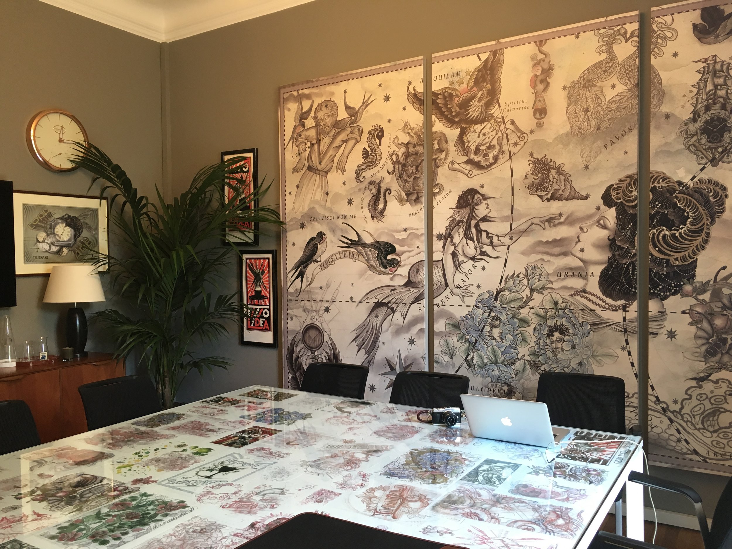
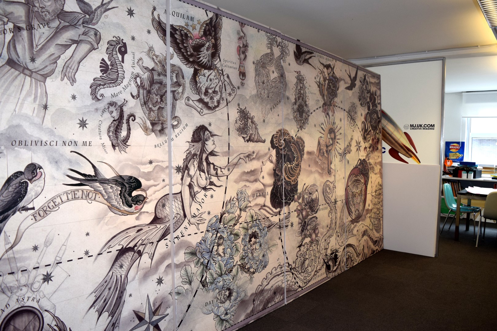
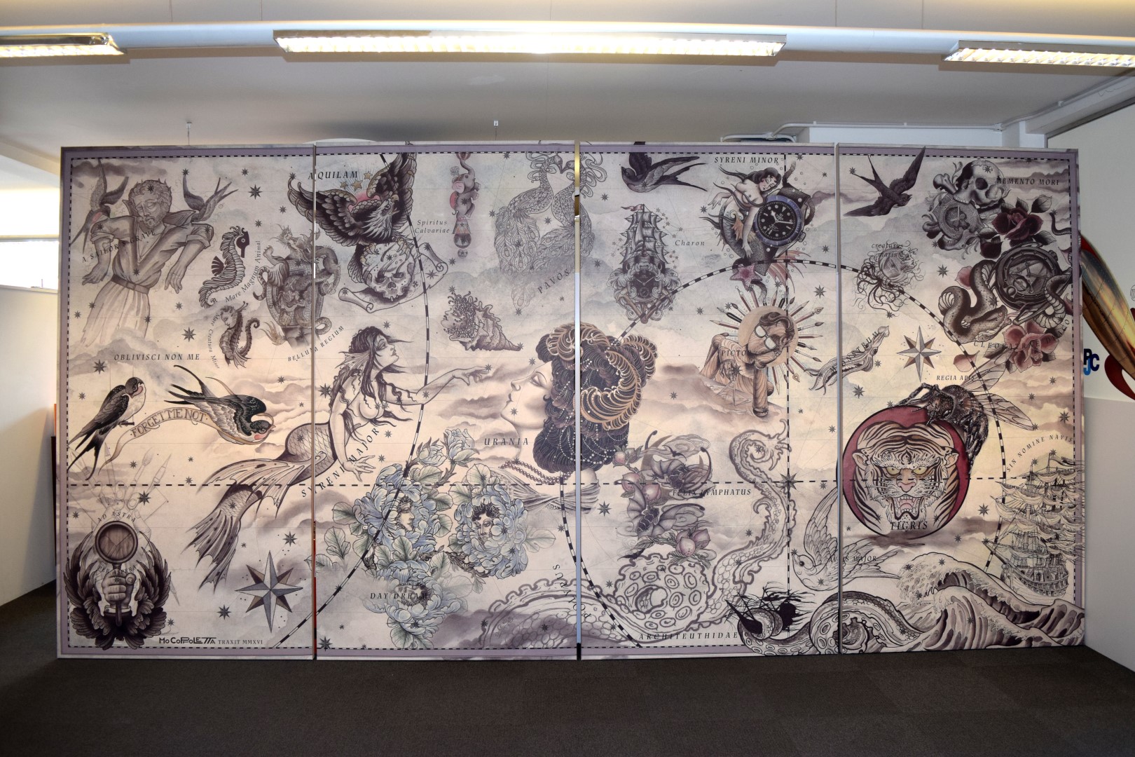
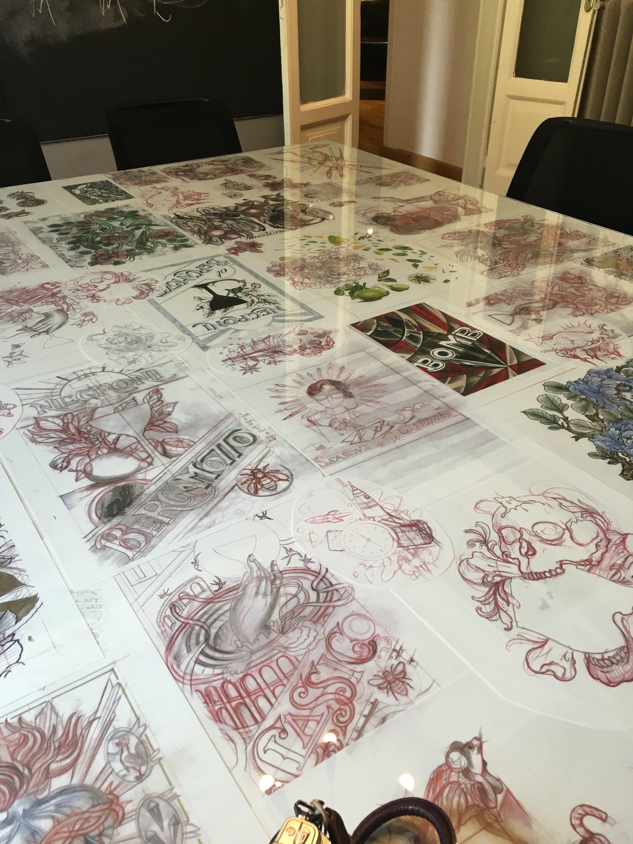
Renowned Tattoo Artist Mo Coppoletta opened his Milan office during the Salon del Mobile. Having previously produced a range of large format prints onto a variety of substrates, we were again commissioned to print the backdrop which would decorate Coppoletta's design meeting room. Recently rated as one of London's best tattoo artists in Time Out, you can find Mo's studio The Family Business in the trendy Exmouth Market location in Clerkenwell. 

LDG & Harry Potter: House of Mina Lima

house of mima lima 1

Last week, the House of Mina Lima opened in Greek Street, London. Here you can find props, original prints and memorabilia for the Harry Potter movie series, all of which were designed and conceptualised by Mina Lima - a design partnership of Miraphora Mina & Eduardo Lima.

You can also see our amazingly vibrant digitaly printed wallpaper and durable, yet soft to touch printed floor graphics. Both are designed to last and will be as colourful as the day we installed them 6 months from now. You can see some of our other exhibition and visitor attraction-based work here.

printed wallpaper and flooring
marauders map harry potter
printed floor graphics

The exhibit (of sorts!) is open now until the middle of next year, so if you'd like to see some of the books, prints and other objects - head down. The space is free to enter and un-ticketed.

You can also see some recent news coverage and Mina Lima's website below for more information.

http://www.minalima.com/about

http://www.dailymail.co.uk/travel/travel_news/article-3633046/Hogwarts-letters-Marauder-s-Map-Daily-Prophet-Spellbinding-new-London-exhibition-features-real-props-Harry-Potter-films.html


Internal Branding & Marketing

Internal Branding & Marketing:

Combining visual communication within the field of display graphics, print and bespoke bookbinding to promote internal branding and marketing awareness in a thought provoking manner. 

We work with creatives in art direction, concept development, brand identity, design graphics, brand language development, critical writing to mention but a few areas.

internal branding and marketing

Forme Partitions: office manifestation

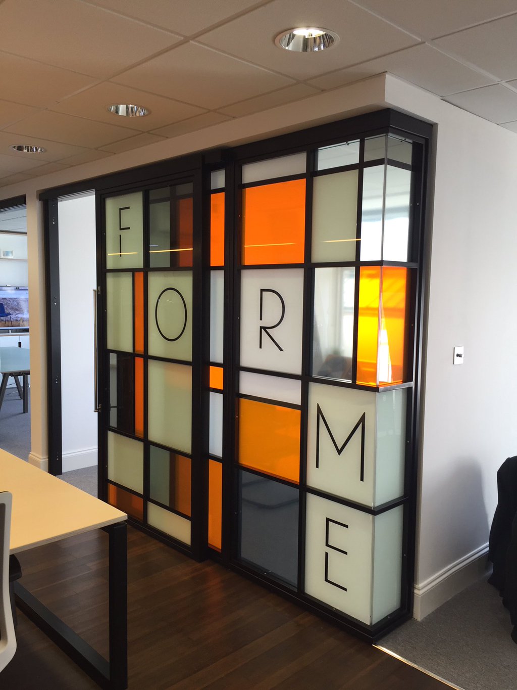
Earlier this month London Display Graphics helped Forme Partitions in realising their Mondrian and Bauhaus inspired window manifestation.

Using an intricate mix of opaque, translucent and cut vinyls enabled us to fully realise and implement the original, complex on-screen design.

Forme were very happy with the end result and it's safe to say; so are we!

You can find more details and imagery of Forme's partitioning here.

window manifesation 1
window manifesation 2
window manifestation 3

Thomas royall - pop up graphic

thomas royall pop up 1

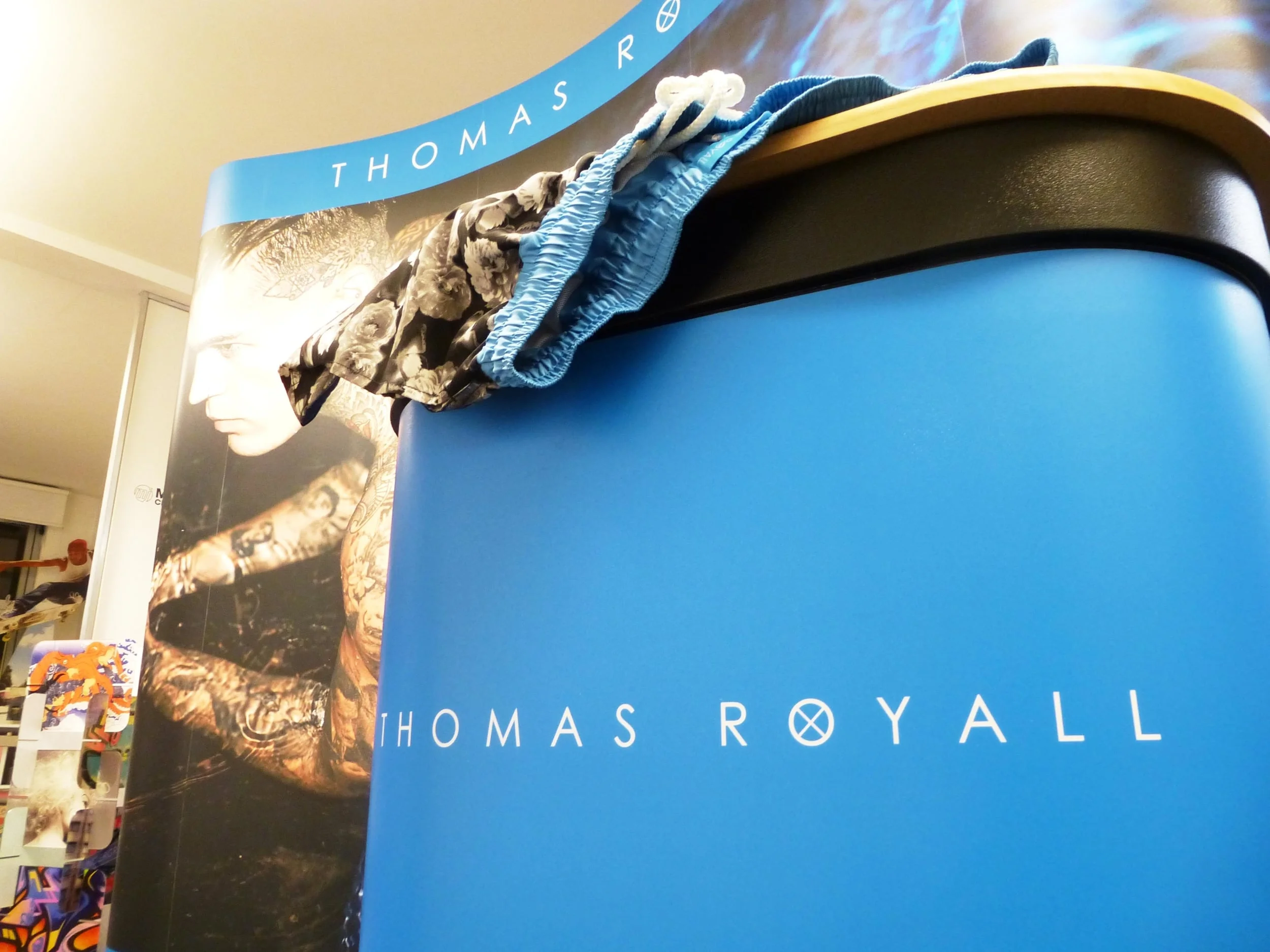
We started off the new year by being asked to produce a 3m by 2m pop up backdrop for a an up and coming fashion brand by the name of Thomas Royall. Their range of designer swim shorts - as recently worn by John Terry and Raheem Sterling - needed a bright and expansive display to sit upon at at the London ExCel centre this month.

The 5 panel collapsible system proves very popular with similar positioned companies as the ease of transport and expandable and portable design makes it easy for users to assemble and adjust depending on the venue.

thomas royall pop up 2
thomas royall pop up 3

For a look at our other display graphics you can head over to our pop up banners section.

Thomas Royall's website is also listed below if you're looking to buy your summer beach wear early!

http://www.thomasroyall.com

'Tis the season...for vinyl manifestation.

Cassia_knoll

It's that time of year again and as the calendar slowly ticks its way over into December shop windows all across the UK start to resemble frosty Disney films and Santa's Grotto.

Every year our client base throws requests our way to decorate and enhance their respective window displays. Specifically this week, Knoll and Cassina tasked us with replicating the visual briefs below using a mixture of window decals and cut-vinyl. Our contour and vinyl cutters were able to fully depict the supplied artworks and both jobs were finished off in a timely manner by our in house installation team.

cassina window vinyl
knoll window vinyl
window vinyl 1
window vinyl 2
window vinyl 3

For a better look at our other window graphic work, head over to our window decal section.

Cassina and Knoll have been supplying furniture for several years now. For a more detailed look at their ranges and styles please head over to their respective websites below.

www.cassina.com/en

www.knoll.com


In With the Spiders @ London Zoo

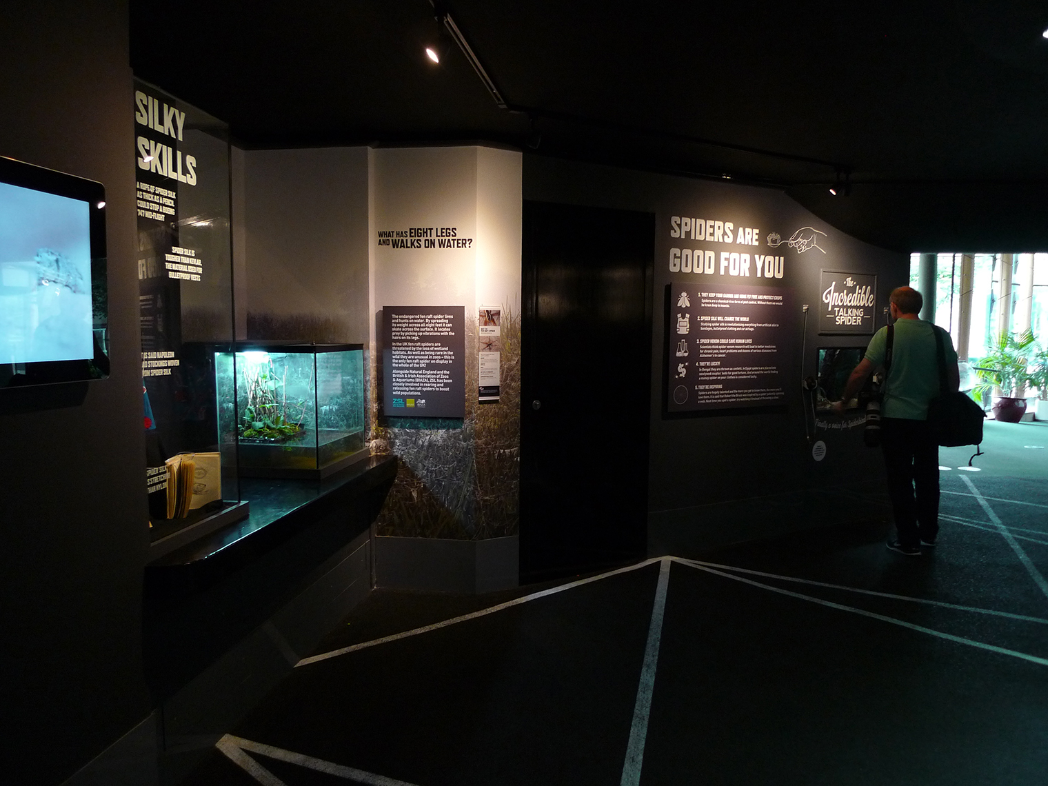
Back in early Summer London Display Graphics produced a huge array of internal signage and graphics for the current ‘In With the Spiders’ Exhibition within London Zoo. The whole aim of the exhibit is to allay certain fears and misconceptions regarding spiders. So if you are a bit squeamish at the sight of our 8-legged friends, we do encourage you to give the rest of the blog post a read…there is hope!

"In with the Spiders will bring people face-to-face with amazing arachnids from around the world in a completely unique and immersive experience..." – ZSL London Zoo website.

It is the first exhibit of its kind to offer a walk through experience with live spiders situated in and around the ceilings and walls. There is also a specific pay to enter program whereby those with various fears and concerns surrounding spiders can be shown and taught the various facts and myths to do with the often-feared creatures. By the end of this paid guide and experience (with potential mantle piece certificate in hand), it's hoped those with arachnophobia can be cured.

*This course runs for 4 hours once a month up until the end of October, for more information click here.

London Display Graphics were responsible for near all environmental and way finding signage, ranging from: printed rainforest window graphics, fabric stretched information panels, stenciled wall lettering and imagery, cut vinyl lettering and acrylic guide labels. With the metres and metres of print produced and installed there is a clear stamp of quality and consistency throughout the area – of which we’re proud to showcase as a prestigious case study.

Luckily for our ‘brave’ install team, the spiders weren’t quite ready to be placed around the exhibit at the time of install. Instead they were able to see the exhibit take shape and work towards ensuring even the smallest printed elements were produced with longevity and aesthetical quality in mind.

For a more detailed look at our work and the exhibit itself, the video below is a great opportunity to see all the elements up close. There is also a great introduction and explanatory guide as to what the exhibit offers for young and old.

To see more of our exhibition work this year, head over to our main page where you can see LDG’s Butterfly House case study at Whipsnade Zoo.

Exhibition Work: 'Waterloo, Wellington & Westminsiter'

house of parliament waterloo 1

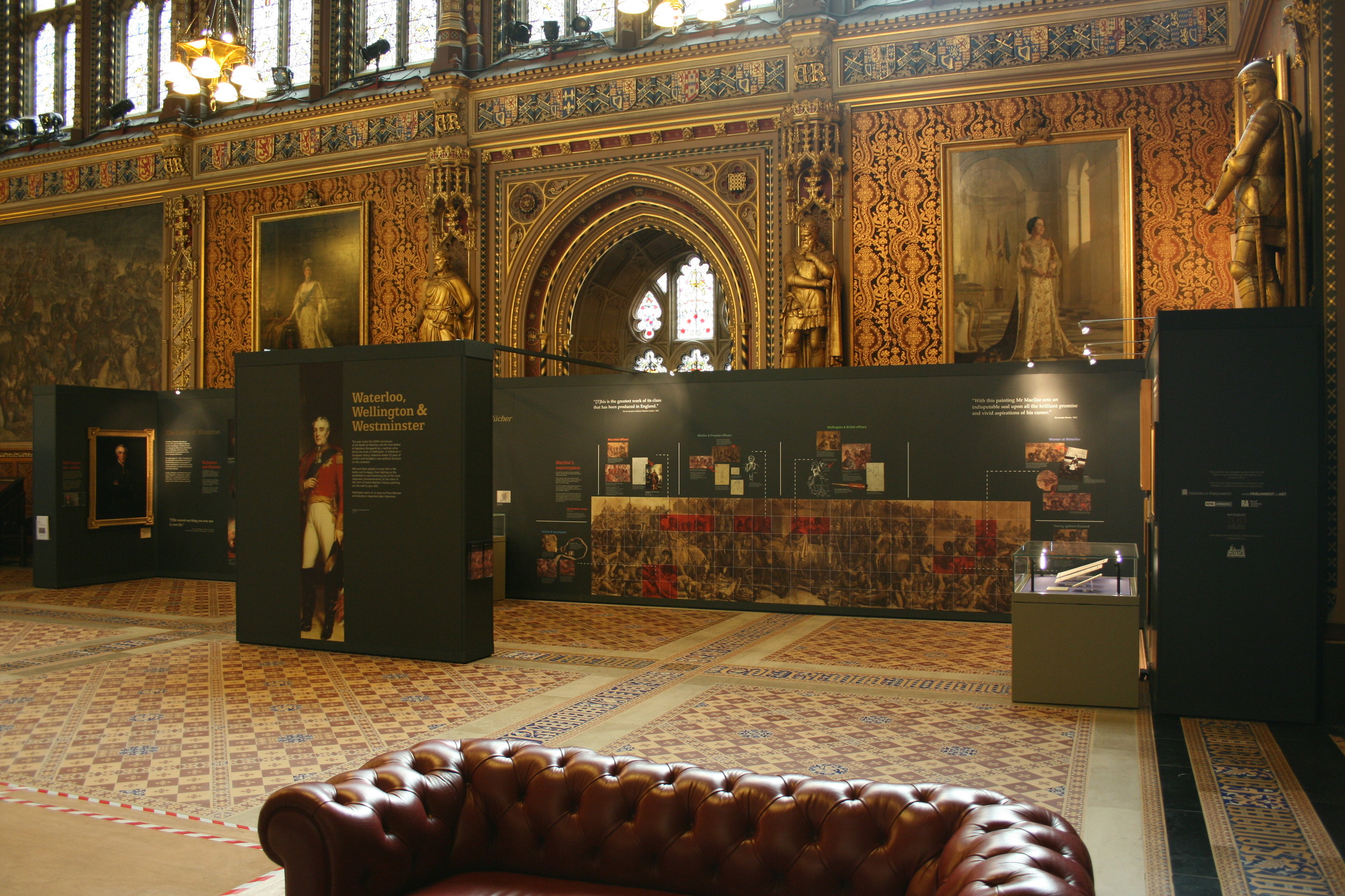
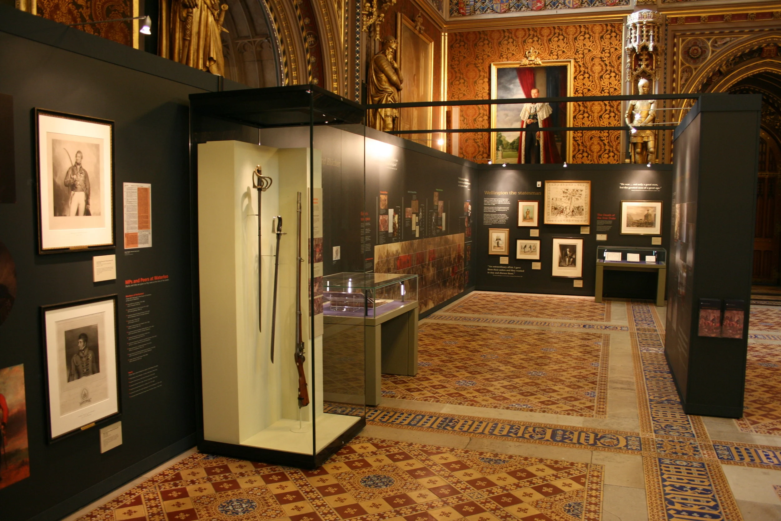
This month, London Display Graphics decided to get all parliamentary and proper. The ‘Waterloo, Wellington & Westminster’ exhibit within the Royal Gallery at the Houses of Parliament now showcases a selection of printed black foamex panels neatly finished with overlaid metallic gold vinyl.

The exhibit itself explores Parliament's connections with the Battle of Waterloo, timely in connection with the event's 200 year anniversary. The exhibit as described by Parliment.uk is listed below:

•••

"Waterloo, Wellington & Westminster' will explore the connections between Parliament and this key event in European history, which saw the final defeat of Napoleon Bonaparte by a coalition army led by the Duke of Wellington.

MPs and Peers played crucial roles in the battle and its legacy, from fighting on the battlefield to commissioning one of the most important commemorations of the event in the form of Daniel Maclise’s famous painting 'The Meeting of Wellington and Blücher after the Battle of Waterloo' (above)."

house of parliament waterloo 4

•••

LDG employed a number of new techniques to meet a creatively challenging brief. One stipulation by the client was that no white should be visible along the vertical edges of each panel. They also had large areas of solid colour for the background, which needed to consistent in shade and tone across the entire exhibit. So rather than print the background, our team came up with the idea to mount a pantone-matched grey vinyl to black PVC foamex. UV print was then applied on top in the form of white ink for text and to back imagery and pictures; having them appear exactly as they would have on screen. The last client-drive request was to have the main titles stand out from the rest of the print. It was decided that we use a separately applied gold metallic vinyl to fit the need that also helped to bring in and compliment the gold gilded frames used on the exhibit and all around the gallery.

house of parliament waterloo 2
house of parliament waterloo 3
house of parliament waterloo 5
house of parliament waterloo 6

The exhibit (now open to the public) runs until the 24th of September of this year, so get there while you can! To see our work in the flesh and explore and engage with the history behind the fascinating Battle of Waterloo and its associations with Parliament, you will need to join a guided tour. For more information please visit the Houses of Parliament’s website here.

http://www.nam.ac.uk/waterloo200/

http://www.parliament.uk/about/art-in-parliament/news/2015/april/waterloo-wellington--westminster-exhibition/


IAB Mobile Engage 2015

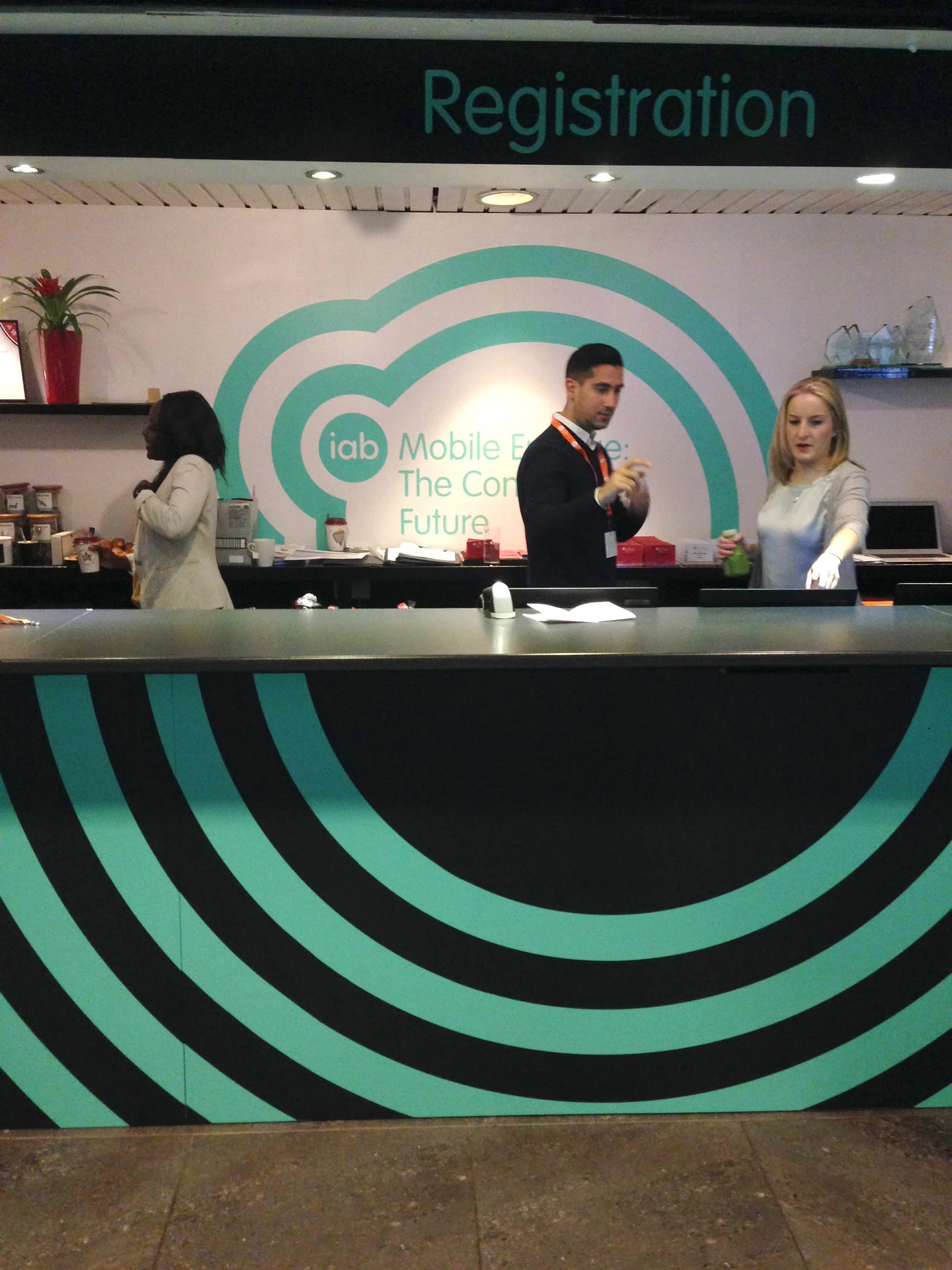
Last week London Display Graphics produced an array of signage for the annual Mobile Engage conference. Celebrating and showcasing the power and effectiveness of mobile connectivity as well as the opportunities it offers for brands and specific organisations.

The bulk of the production produced detailed mint green vinyl mounted onto white and black PVC plastic boards and vast amounts of cut and applied way-finding vinyl graphics. The most significant production method included mounting full sheets of 3mm Foamex with Mint vinyl and kiss cutting the artwork to peel away and leave a clean and finished design; creating an essential time-saving technique for nailing consistent colour and finish. This minty eye candy created a vibrant and consistently themed atmosphere within and throughout the Mermaid Theater in London Blackfriars, EC4, of which this was the 6th year running of the conference.

Eye-engaging and energetic, the circular and patterned design (created by O-Street - http://www.ostreet.co.uk/) created a kinetic and aesthetically pleasing atmosphere full of fluidity and energy, while still in-keeping with the technological and modernistic tones of the content within the conference.

The multitude of way-finding graphics, flat-bed printed signage and even glow in the dark cut vinyl lighting up the auditorium really did engage and challenge our production house, enriching a dynamic project with creative problem solvers and solution givers.

Until next year!

I got 21m's to go...

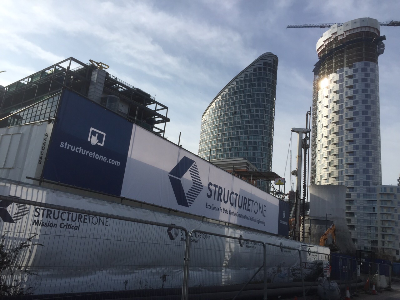
We recently supplied Structure Tone with an outdoor large format mesh banner. Situated in the bustling corporate district of Canary Wharf, Structure Tone's latest construction graphic helps to aesthetically improve an otherwise commonly perceived dull and messy looking construction site.

The banner measures an impressive 21m by 2.5m's - spanning the entire section of a cordoned off area. Eyeleted, hemmed and made from a wind resistant mesh, the banner is perfect for any outdoor areas and temporary sites whatever the weather.

Check out our other construction based graphics here.

large_mesh_banner_1
large_mesh_banner_2

Local site hoarding in Charterhouse Square..

Following on from our last blog, we find in the beautiful and very historical setting of Charterhouse Square, a lovely colourful site hoarding designed by Velorose. This local design studio collaborates graphic designers, product designers and artists to mention a few - across a broad range of services that include refurbs, new builds, interiors, graphics, branding..the list goes on! 

A lovely mix of pastel colours and imagery of Charterhouse square..Oh we do love a good hoarding!

www.velorose.com

Site Hoarding and Signage..

Calling all Designers, Construction companies, Building managers, Property developers..
You know who you are!!

We’re seeing a massive trend in designed and printed site hoardings..Not only through our doors, but everywhere you look! A visual tonic for the eye, rather than seeing the usual plain plywood wooden panels (boring!). Why not print direct to the plywood!! We’ve been printing direct to these substrates for years now! Designers and agencies are getting commissioned more these days to produce some great looking design on these hoardings. It always has and always will be a huge platform for advertisement, highlighting the anticipation for the project ‘behind the hoarding’ even more. Give us a call now..!